



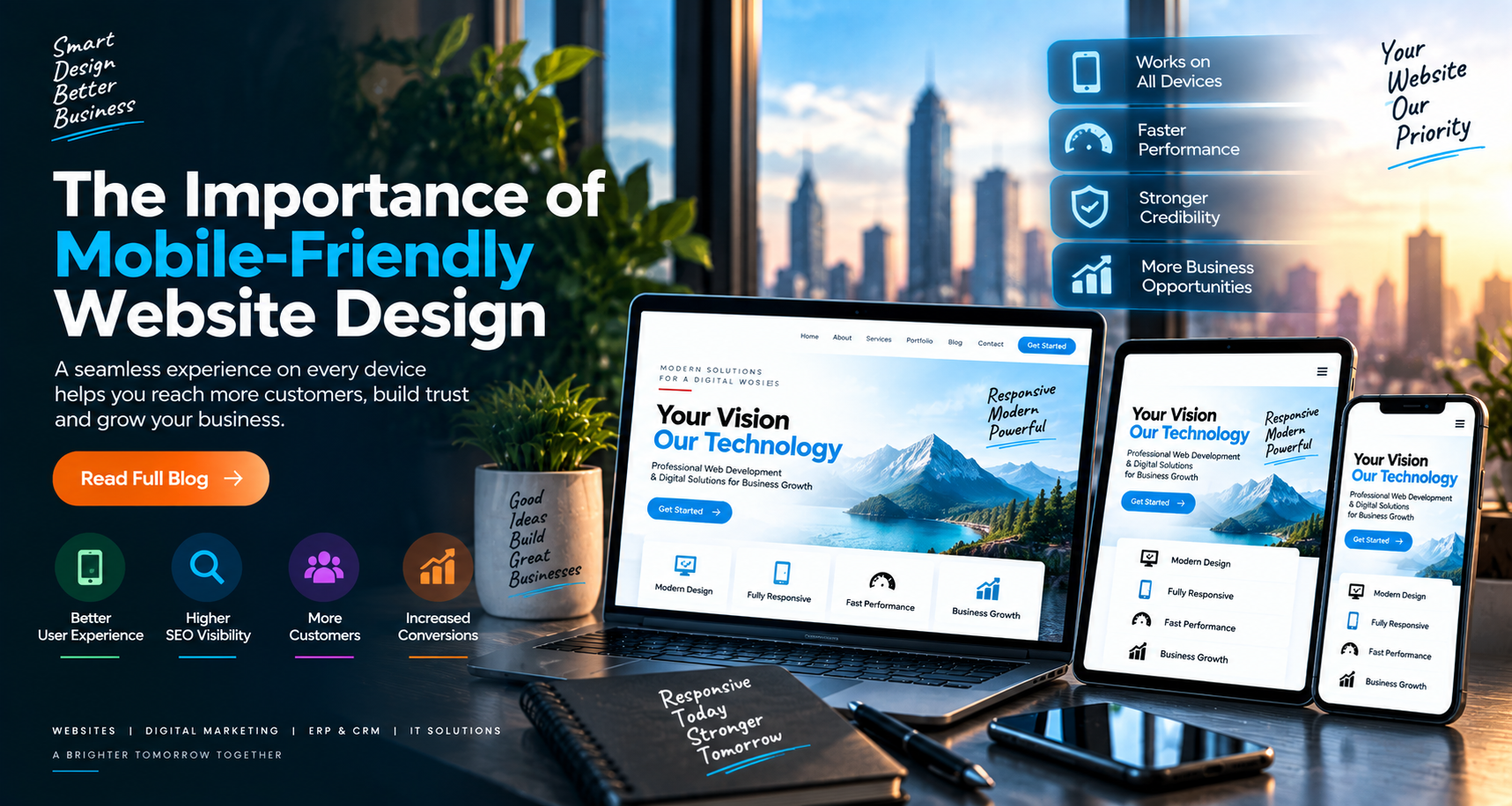
More people are using smartphones and tablets to browse the internet, discover businesses, compare services, and make purchasing decisions. As a result, having a mobile-friendly website is essential for businesses that want to provide a smooth user experience and remain competitive in the digital marketplace.
1. Improves User Experience
A mobile-friendly website automatically adjusts its layout, images, text, and navigation according to the visitor’s screen size. This makes the website easier to browse on smartphones, tablets, laptops, and desktop computers.
2. Reaches More Mobile Users
Many potential customers access websites through mobile devices. If a website is difficult to use on a small screen, visitors may leave quickly. Responsive design helps businesses reach and retain more mobile users.
3. Supports Search Engine Visibility
Search engines consider mobile usability when evaluating websites. A responsive, fast-loading, and user-friendly website can support better search engine performance and improve online visibility.
4. Increases Customer Engagement
When visitors can easily read content, explore services, view images, and complete contact forms, they are more likely to interact with the business. A better browsing experience can lead to increased inquiries and conversions.
5. Creates a Professional Impression
A website that works smoothly across different devices reflects professionalism and reliability. On the other hand, broken layouts, unreadable text, and difficult navigation can negatively affect a customer’s perception of a brand.
6. Improves Website Performance
Mobile-friendly websites are often designed with optimized images, clean layouts, and efficient code. These practices can help improve loading speed and reduce unnecessary user frustration.
7. Makes Navigation Easier
Responsive websites use mobile-friendly menus, readable typography, properly sized buttons, and simple page structures. These features help visitors find important information quickly and comfortably.
8. Increases Conversion Opportunities
A mobile-friendly website makes it easier for customers to call, send inquiries, submit forms, book services, or purchase products. A smoother user journey can support better conversion rates.
9. Reduces Maintenance Requirements
With responsive design, businesses can maintain one website that adapts to multiple screen sizes. This is more efficient than managing separate desktop and mobile versions of a website.
Conclusion
A mobile-friendly website is no longer an optional feature. It is a fundamental requirement for businesses that want to provide a modern digital experience, reach more customers, improve visibility, and increase conversions.
Build a Responsive Website with One IT Digital
At One IT Digital, we design and develop responsive, fast, modern, and user-friendly websites that work smoothly across all devices. Our solutions help businesses create a strong online presence and deliver better digital experiences to their customers.